

Legendary artists used bold colors to stand out—now you can, too
Explore a New Sonic Palette
The Gibson Les Paul™ and SG™ designs are among the most iconic electric guitars in history, and countless guitar legends have made them a part of their visual identity. Whether you’re sporting a single or double-cutaway design, you’re in good company among rock royalty who’ve gravitated toward these historic silhouettes in vintage colors for decades.
But what if you are looking to break the mold and take to the stage with an instrument that has a style as individual as your own—something beyond a ’burst or Vintage Cherry finish? Enter Gibson’s new Custom Color Series. Discover the Les Paul Standard 50s and Les Paul Standard 60s models from Gibson USA, now joined by the SG Standard and SG Standard ’61, in a rainbow of fresh new colorways.
All models are handmade in Nashville and boast the same exceptional quality, playability, and tone you’ve come to expect from Gibson. The Les Paul Standard 50s features a fuller 50s Vintage neck profile and Burstbucker™ pickups with Alnico 2 magnets for creamy and articulate tones, while the Les Paul Standard 60s offers a bolder voice thanks to the Alnico 5 magnets in its 60s Burstbucker pickups and a SlimTaper™ neck for a slinkier, speedier feel. Both models are available in Plain Top and Figured Top configurations.
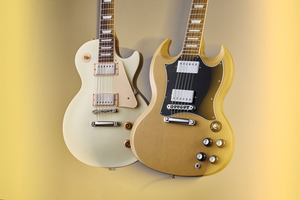
What about the features of the SG Standard? As a new addition to the Custom Color Series, these beauties add exciting new options to liven up any stage or guitar collection. The SG Standards feature a rounded profile mahogany neck, bound rosewood fingerboard, long tenon 19th fret neck joint, and a solid mahogany body that provides the backbone for singing sustain. The 490R and 490T Alnico 2 pickups provide the power to drive. A black, 5-ply, full-face pickguard sets this SG Standard apart from others; it’s a truly versatile classic.
There’s more—there’s an early 1960s-style SG in bold new colors, too. In 1961, the single-cutaway Les Paul model was put on hiatus, and an all-new design evolved into what soon became known as the SG or “solid guitar.” The Gibson SG Standard ’61 retains the styling of the original, featuring a SlimTaper mahogany neck and a bound rosewood fingerboard. The mahogany body features deeply sculpted body scarfing, a 5-ply teardrop pickguard, and a 22nd-fret neck joint. The nickel-plated hardware includes a classic-style Tune-O-Matic™ bridge and Keystone tuners. The pickups are 60s Burstbucker humbuckers™ for a classic voice with added power and top end. Controls feature audio taper potentiometers and Orange Drop® capacitors.
In the Custom Color Series, there’s something for everyone, whether you want to stand out on social media or call back to the classic car colors of the 1960s. Since the world turned Technicolor, the use of color branding has been a powerful weapon in rock ’n’ roll—let’s take a deeper dive into why it’s so effective and look at some of the artists who have used color to stand out from the crowd.
The Evolution of an Artist’s Aesthetic
It has probably happened a million times in garages and dingy rehearsal spaces across the globe: the inevitable meeting where the band’s “look” gets hashed out. Who are we? Do we need a new band name? What will our logo look like? Will we dress up or down? Are we gonna all dress in black and grow out our hair? It’s a clichéd but real and significant part of the rock ’n’ roll machinery that every performer must inevitably consider if they’re genuinely trying to find an audience that streams music and buys concert tickets and albums.
Along those lines, the aesthetic qualities of a rock band’s instruments, particularly their finishes, play a vital role in shaping the band’s visual identity and amplifying an onstage presence. Color, a fundamental element of visual perception, carries significant psychological impact and is capable of eliciting a range of emotional responses from audiences. For example, a bright red guitar might convey passion and energy, while a cool blue might be icier or more aloof. The choice of a muted sunburst finish might signal the subtle aura of a vintage-loving throwback soul. Everything sends a message of some sort, whether it’s intended or not.
In addition to enhancing the emotional impact of performances, the colors of band instruments also contribute to a band’s unique brand identity. In an industry where individuality is highly valued, distinctive instrument colors can set a band apart from their peers, forging a memorable visual signature that fans associate with their music. From The Rolling Stones’ Keith Richards and his “Micawber” Telecaster, which sports a traditional, worn butterscotch finish and is named after a character in Charles Dickens’ novel David Copperfield, to Prince’s iconic Cloud guitars and purple costuming choices, colors become an integral part of the persona and legacy of the artist.
Furthermore, the vivid spectacle of color-coordinated or colorfully unique instruments can heighten audience engagement during live performances, creating an immersive, multisensory experience that goes beyond the music alone. It’s not just the light show carrying water for the band’s stage image—it’s your lovely Les Paul or SG, too.

Glam Rock: A Rainbow of Rebellion
The glam rock era of the 1970s, characterized by artists such as David Bowie, T. Rex, and Elton John, took color use in rock music to new, dramatic heights. Bold fashion, vibrant makeup, and audacious stage designs were integral to glam rock’s identity. These artists harnessed the power of color to challenge societal norms and express individuality.
Bowie’s Ziggy Stardust persona, with its kaleidoscope of bright colors, exotic patterns, and theatrical makeup, pushed the boundaries of visual presentation in rock music. This use of bold, bright colors not only attracted attention but also contributed to the music’s impact, creating a multisensory experience that transcended the audio component of the work.
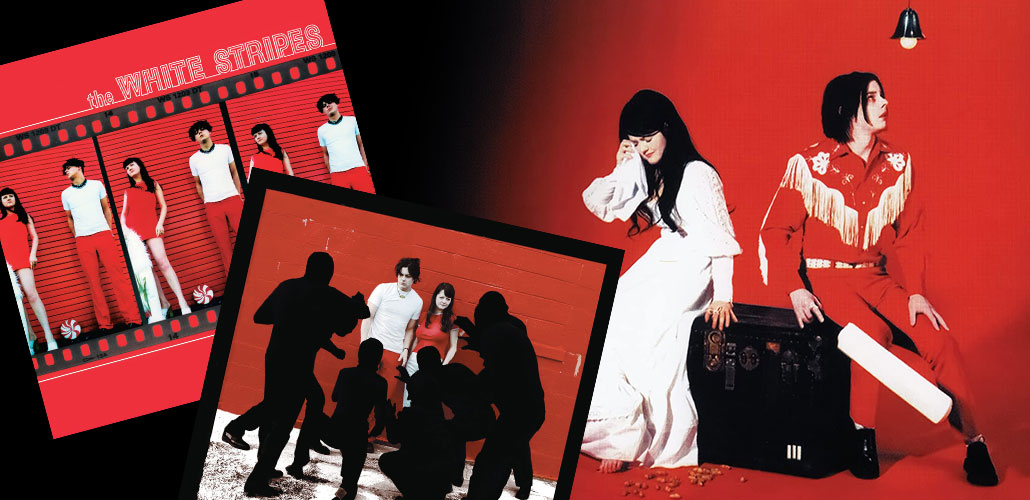
The White Stripes and the Color Red
Throughout the history of rock music, the clever use of color has significantly influenced the perception, marketing, and overall image of many bands and artists. From the strikingly minimalistic palette of The White Stripes to the flamboyant fashion of glam rock, color has often played a pivotal role in cultivating an artist’s identity and engaging audiences.
The White Stripes, a now-defunct American rock duo, provides a compelling case study of color use in band marketing efforts. Comprised of Jack and Meg White, the band adopted a simple but powerful color scheme of red, white, and black. This choice was intentional and infused with symbolism. The vivid red, stark white, and bold black color palette became a visual representation of their raw and minimalist garage-rock sound.
From album covers to stage setups and clothing, the color scheme consistently permeated The White Stripes’ branding, establishing a distinctive and immediately recognizable visual identity that reflected their musical ethos. This commitment to a defined color scheme set them apart in the musical landscape and arguably played a part in their global recognition and success in the early 2000s.
Other Examples of Color Marketing to Ponder
Many rock bands have utilized color as a central part of their marketing strategy to establish a unique brand identity. Here are some notable examples:
The Beatles:
The Beatles employed color notably in the cover art of their “Sgt. Pepper’s Lonely Hearts Club Band” album, which showcased them in brightly colored military-style outfits against a vivid background. It’s an image that has become iconic in rock history. The absence of color in the sleeve art for “The Beatles (The White Album)” also made a bold statement.
KISS:
The American rock band KISS is renowned for black and white face makeup along with black outfits and instruments. Their color scheme, combined with elaborate stage performances and pyrotechnics, made their shows a visual spectacle.
Pink Floyd:
Pink Floyd didn’t adopt a specific color scheme, but their album covers, such as the iconic prism and rainbow on “The Dark Side of the Moon,” made powerful use of color.
U2:
For their “The Joshua Tree” album, U2 took a different approach. The monochromatic sepia-toned cover was a stark contrast to the brightly colored album covers prevalent in the 80s. This also reflected the album’s thematic departure from their earlier work.
Coldplay:
Known for vibrant artwork and music videos, Coldplay’s use of color has evolved with each album, from the black and white, blue-accented “A Rush of Blood to the Head” to the rainbow-hued “A Head Full of Dreams.”
Iron Maiden:
This heavy metal band is well-known for their colorful album covers featuring their zombie-like mascot, Eddie, in various scenarios. These detailed, vivid artworks have become an integral part of their brand. Often, but not always, their logo is bright red: stark, bold, and memorable.
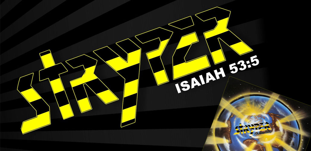
Stryper:
Yellow and black—this striking contrast is reflected in their album covers, stage outfits, stage lighting, and merchandise, creating a distinct identity. The yellow and black theme was more than just a visual element; it also had symbolic implications. The band stated that yellow represents God’s light shining in the darkness, represented by the color black.
Digital Culture and Visual Aesthetics
The advent of digital culture, particularly social media platforms like Instagram, further magnified the importance of color in music marketing. Instagram, as a visually oriented platform, transformed how bands and artists connect with fans. Bands can create a curated aesthetic that contributes to their brand identity and musical message.
Eye-catching photography, consistent color palettes, and thoughtfully designed cover art create a visual narrative that complements the music and draws listeners into the artist’s world. This visual component, when harmonized with the audio, may enhance audience engagement and contribute to an artist’s success in the crowded digital music landscape.
The strategic use of color in marketing is a powerful tool in the music industry. Whether through a signature color scheme like The White Stripes, the bold hues of glam rock, or the curated aesthetics of Instagram, color amplifies a band’s message, creates a unique identity, and deepens the connection between artists and their audience.
Explore the entire range of colors available now in the Gibson Custom Color Series.
